
A recent critique with my colleagues at Momento Collective has been so useful in re examining my art practice- posing questions such as my use of colour- or lack of use of colour.
A couple of years ago I made a time lapse video following the tide patterns in a small cove over several days. I filmed during the night which created quite dark uneventful periods in the footage. When I started editing the video I experimented with manipulating the colour to accentuate the movement and time phases and to liven up the night time sequences. This produced a visually stimulating effect and dare I say beautiful imagery.
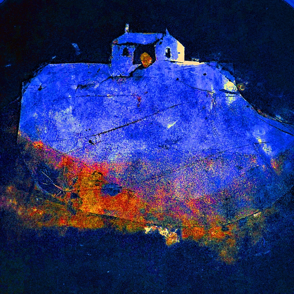
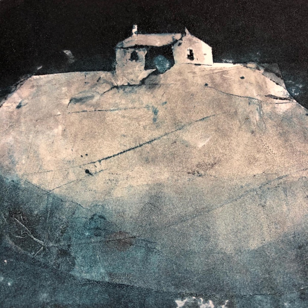
So with reference to this I have now contemplated playing with colour in my mono print work. This is early days and I hope may lead to using more colour in the studio when I make prints. This is a quick experiment with one print below, what do you think?
I would love to hear your comments and suggestions.
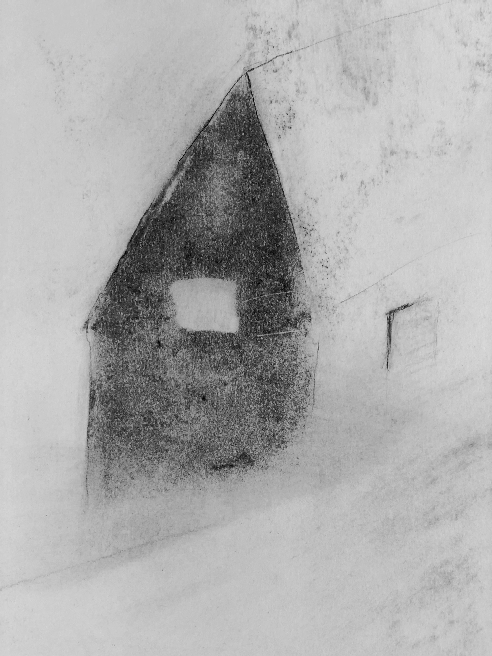
and below is the original print:

Us artists have to learn to accept critiques. It is the best tool for making us bettger at our given talent. I really like this work you displayed here.
Have a gorgeous week.
LikeLiked by 1 person
Yes I agree thanks for commenting 🙏🏼☺️
LikeLiked by 1 person
My pleasure. Have a great week.
LikeLike
Thanks so much for your comments. It’s quite daunting presenting work to a group of people, but also great to hear their impressions and feeling to the work. I now have to respond to the feedback and will be interested to see how it turns out. I did make a series of mono prints for a project a year ago which in fact was very colourful- as it was images from my garden. It felt right for the subject. The chapel images are trying to convey time and memory, which I feel should be almost monotype- dreamlike? Do we dream in black and white? What do you think? Thanks again for commenting. All the best, Caryl
LikeLike
I like the strong contrast between orange and blue, very different in feel from the original. I’m wondering what it would look like with colors less saturated?
LikeLike
Hi Eliza Thank you for your comment. In the critique of my original work it was mentioned that my time lapse video had been enhanced with colour and so I thought I would try out a similar effect on my mono prints to see how it looked. The idea was then to produce new mono prints using more colour. I agree that more subtle colour would be an interesting experiment- as we know colour can be seductive and maybe detract from the subject matter/concept. When I next go to the print studio I will see how it pans out. Thanks again for responding. Caryl
LikeLiked by 1 person